One of the top communities for data science is the online-community of kaggle.com. There are tutorials, discussions, datasets and online competitions on this website. Beyond that, kaggle is one of the most important tools of the open source data science community. Not only through the sharing of code and datasets, but mostly by crowd sourcing data science projects through competitions. Even top notch tech companies have leveraged the power of these competitions and reward participants with high prizes (at the time of writing, the highest being $100,000 offered by Jane Street Group).
How successful is a user?
To further motivate the participation in the publishing of code, creation of datasets and competitions, kaggle has established a ranking system for its community. The users can climb different ranks, by completing different requirements that get increasingly harder. At the moment, there are 5 different ranks - in increasing order:
Novice
Contributor
Expert
Master
Grandmaster
For more information on these ranks, visit kaggle’s help-page
Exploring the Kaggle Community
In an effort, to get a better idea of the data science community we use data published by kaggle itself about things going on in its user body. The data can be found here: Meta-Kaggle
Number of Followers
Beyond its service to the data science community, kaggle also provided meta-data about what is going on its website. Hence, everybody can access and explore what is going on!
1
2
3
4
5
6
7
8
9
10
11
12
13
from IPython.core.display import display, HTML, Markdown import json import pandas as pd import numpy as np import seaborn as sns import networkx as nx import matplotlib.pyplot as plt import matplotlib as mpl import matplotlib.colors import os
We can make use of the kagglemodule, it yields CLI commands that we can use to interact with kaggle via an API interface. This API makes it possible, to directly download datasets from within your script, like we did below. The CLI commands are commented out below.
Next we load in the data about kaggle’s users and their followers and wrangle with it. The goal is to get a nice data frame of followers and users. We won’t discuss the data structure here, so feel free to check out the data yourself (see link above).
1 2 3
# load the datasets df_followers = pd.read_csv('./meta-kaggle/UserFollowers.csv') df_users = pd.read_csv('./meta-kaggle/Users.csv')
1 2 3 4 5
# merge the user information to the user followings dataset col_select = ['Id','DisplayName','RegisterDate', 'PerformanceTier']
# drop the Id and Id_y columns, they are duplicates of FollowingUserId & UserId. Rename id_x to id as it identifies each edge uniquely df = df.drop(['Id', 'Id_y'], axis=1) df = df.rename(columns={'Id_x':'Id'})
%%capture # how many performance tiers are there? The Tier No. 5 resembles Kaggle officials df['PerformanceTier_user'].unique()
1
df.shape # there are 550k+ connections
(566020, 10)
1 2 3 4
%%capture # create an aggregated dataset of followers - top 5 kaggle users (most followers) df_agg = df.groupby('DisplayName_follower').size().reset_index(name='counts') print(df_agg.sort_values('counts', ascending=False).head(5).to_markdown())
1
df_agg.shape # the 5 most followed kaggle users are contained in here
(88877, 2)
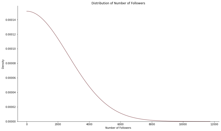
Interestingly, we see that the 5 most followed kaggle users account for nearly 90,000 out of 550,000 links between users (connections), which is around every sixth connection! This leads us to further explore the number of followers each user has. For that purpose we created a density plot below.
1 2 3 4 5 6
# create a density of number of followers - hard smoothing of density! g = sns.displot(df_agg[df_agg['counts']>0], x="counts", kind='kde', cut=0, bw_adjust=250, color='#935F63')
g.fig.set_figwidth(15) g.fig.set_figheight(7.5) g.set(xlabel='Number of Followers', ylabel='Density', title='Distribution of Number of Followers')
<seaborn.axisgrid.FacetGrid at 0x16906b16dc0>
As expected, the distribution is skewed to the right - there are many users with only a few users, but only a few users with many followers. It gets harder to “get to the top”, there are fewer people there!
Kaggle Ranks of Users
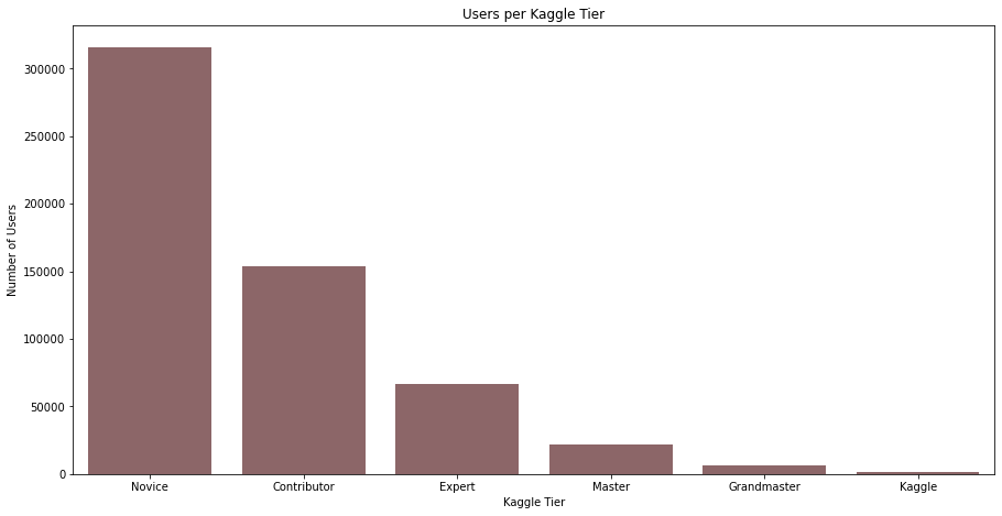
Besides the number of followers, we are also interested in the different kaggle ranks. How many novice users are there? And how rare is it to be a grandmaster? To get an idea, we plotted the number of users for each tier below in a bar plot. As expected, we again see a funnel towards the more exclusive tiers. This makes sense, it is very difficult to reach the grandmaster level and only a few people have the ability and motivation to do so.
1
df_rank = df.groupby(['PerformanceTier_user']).agg(['count']) # count the number of users per kaggle tier
1
df_rank.reset_index(inplace=True) # move the index to its own column
# create barplot for the quantities fig = plt.figure(figsize=(15,7.5))
g = sns.barplot(x=df_rank['kaggle_tier'], y=df_rank.iloc[:,2], color='#935F63') g.set(xlabel='Kaggle Tier', ylabel='Number of Users', title='Users per Kaggle Tier')
[Text(0.5, 0, 'Kaggle Tier'),
Text(0, 0.5, 'Number of Users'),
Text(0.5, 1.0, 'Users per Kaggle Tier')]
Social Network at the Top
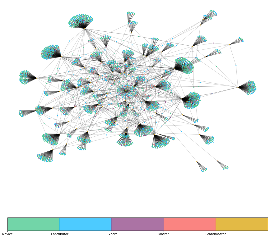
Now that we have looked at the quantities of followers and the number of users in the different tiers, we can go a step further and think about the connections between these users. Who is following grandmasters? Are they following each other, like an exclusive circle? First we will need to prepare the data a bit, but later on we create a graph showing a fraction of the network of the 100 most followed kaggle grandmasters.
1 2 3 4 5 6 7 8 9 10 11 12 13 14 15 16 17
# create an attribute dataframe defcreate_attr_df(df): """ This function creates the attribute dataframe, that is used to color the nodes later on. :param df: The dataframe from kaggle :return: Returns the attribute dataframe """ tmp_user = df[['UserId', 'PerformanceTier_user']] tmp_user = tmp_user.rename(columns={'UserId':'id', 'PerformanceTier_user':'tier'})
# get the most frequented grandmasters n = 100 top_list = df['FollowingUserId'].value_counts()[:n].index.tolist()
1 2 3 4 5 6 7 8 9 10 11 12
# subset the dataframe to all grandmasters df_mini = df[(df['PerformanceTier_follower'] == 4)] df_mini = df_mini[df_mini['FollowingUserId'].isin(top_list)]
# take a sample, to improve computation time df_mini = df_mini.sample(n=5000)
# create the attribute dataframe df_mini_att = create_attr_df(df_mini)
# create the grpah object G = nx.from_pandas_edgelist(df=df_mini, source='UserId', target='FollowingUserId')
1 2 3
# assign the attributes to the graph node_attr = df_mini_att.set_index('id').to_dict('index') nx.set_node_attributes(G, node_attr)
1
2
3
4
# create custom colormap - color according to ranks colors on kaggle
cmap = mpl.colors.ListedColormap(['#4FCB93', '#20BEFF','#96508E', '#F96562', '#DCA917', '#1B96C3'], N=5)
boundaries = [0, 1, 2, 3, 4]
norm = mpl.colors.BoundaryNorm(boundaries, cmap.N, clip=True)
Finally, we can plot the graph in the appropriate colors. Note that the graph shows 100 grandmasters and a sample of their followers. Interestingly, there seem to be some grandmasters that follow a non or a few other grandmasters (outer part of the graph), while some of these users seem fairly interconnected with different other accounts (center of the graph). Also, it is apparent that most of the followers seem to be novices and contributors (blue and green colors in the clusters).
Furthermore, in between the different clusters at the center of the graph, it looks like a good share of the points connecting multiple clusters are more on the purple and red side. This could hint at expert and master users following multiple of the most popular grandmasters, hence establishing edges between them. In fact, this would make sense as these users are probably more involved in the community and might have established “real connections” to some of the high profile users, while lower tier users might just be “followers” of these grandmaster accounts.