Label your Seaborn Plots Axis and Legend!
In this code snippet, we look at how to edit axis and legend labels in seaborn. While this is a very basic task, it is one I find myself often searching the internet for. To give you (and me) a shortcut to a code example, I created this little post.
1 | # load modules and get a data set |
1 | # ds-econ style sheet! |
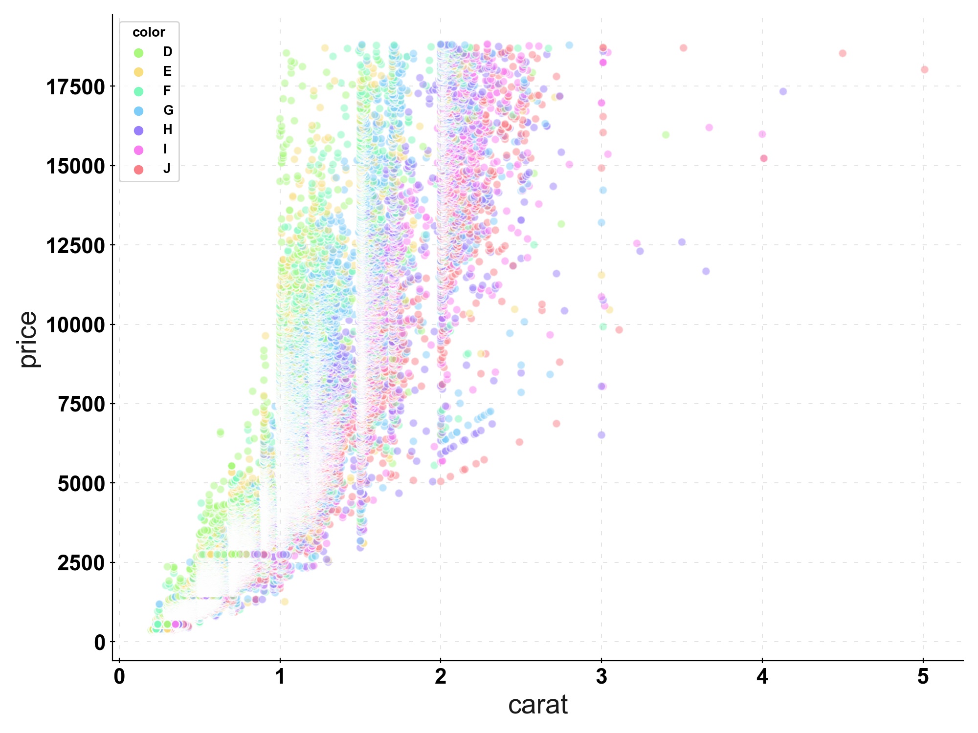
A quick look at the data: We got information on diamonds, their characteristics and their prices. A classic example is to plot the diamond’s price against their weight in a scatterplot and color the points by the diamond’s color.
1 | df.head(10) |
| carat | cut | color | clarity | depth | table | price | |
|---|---|---|---|---|---|---|---|
| 0 | 0.23 | Ideal | E | SI2 | 61.5 | 55.0 | 326 |
| 1 | 0.21 | Premium | E | SI1 | 59.8 | 61.0 | 326 |
| 2 | 0.23 | Good | E | VS1 | 56.9 | 65.0 | 327 |
| 3 | 0.29 | Premium | I | VS2 | 62.4 | 58.0 | 334 |
| 4 | 0.31 | Good | J | SI2 | 63.3 | 58.0 | 335 |
| 5 | 0.24 | Very Good | J | VVS2 | 62.8 | 57.0 | 336 |
| 6 | 0.24 | Very Good | I | VVS1 | 62.3 | 57.0 | 336 |
| 7 | 0.26 | Very Good | H | SI1 | 61.9 | 55.0 | 337 |
| 8 | 0.22 | Fair | E | VS2 | 65.1 | 61.0 | 337 |
| 9 | 0.23 | Very Good | H | VS1 | 59.4 | 61.0 | 338 |
To start off, we create a simple plot using sns.scatterplot(). While the visualization looks quite nice, we can make the graph even easier to understand by improving its labels.
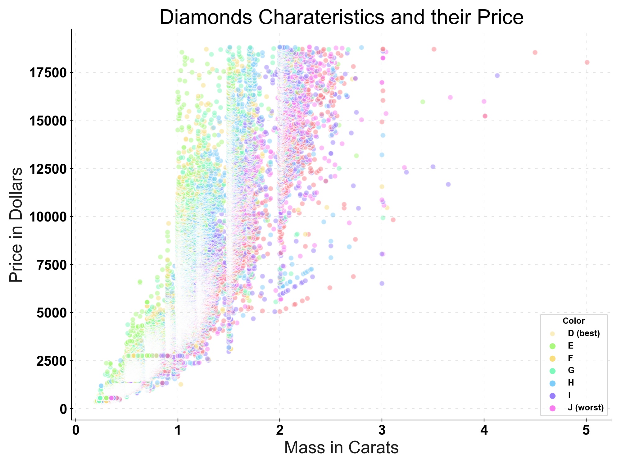
On the x-axis we have a unit, while we have a measurement (in this case of “value”) on the y-axis. It would be better, to have the measurement and the unit it is measured in on both axes, yielding a better intuition of what we see here. For this, we use ax.set(xlabel, ylabel).
Furthermore, we can improve the legend. We can adapt its title, move its location to a spot that is less crowded and give the audience a bit of help with understanding the “color labels”. As it turns out, these colors are a ordinal scale i. e. “color D” is preferrred to “color J”, we can indicate that by adjusting the labeling such that D is the “best” color for a diamond, while J is the “worst” color for a diamond. We can adjust the legend by using plt.legend(title, loc, labels.
Finally, we can make our plot be fully understandable on its own, by giving it a title. We add a title with plt.title(title).
Note how we made use of the alpha argument in sns.scatterplot to deal with overplotting.
1 | # create the plot, init fig and ax |
See below for the implementations of these improvments and the final plot!
1 | # create the plot, init fig and ax |
Label your Seaborn Plots Axis and Legend!